
Naf Scents Master Logo
Naf Scents·دار ناف للعطور
Brand Standards & Design System
Design System · Owner Approval Pending v2.4 · 12 Nov 2026
Asset Register
Design System & Governance Codex · Pending Approval

Naf Scents Brand Standards: Identity, Packaging and Digital Design.

This guide defines how Naf Scents should look, sound, and behave across packaging, retail materials, and digital products, with consistent English and Arabic execution.

Authority Riyadh Atelier & Paris Bureau
Revision v2.4 · 12 Nov 2026
Integrity Review pending
Codex Digest
Primary Mark Naf Scents Ribbon Monogram
Core Palette Ratio 60% Canvas / 30% Obsidian / 10% Sand
Display Font Noto Serif & Noto Naskh Arabic
Luxury Alignment Bilingual GCC Restraint
A blank glass flacon with amber liquid and an agarwood chip on a travertine block in a sunlit arched corridor with an olive tree. AI-generated illustrative image.
Campaign Scenography · Reference Specimen
Illustrative AI-generated image. Generic flacon, not owner-approved.
"The Art of Arabian Haute Parfumerie."

Art direction marries crystal flacon craft with warm sunlit travertine and contemplative Arabian luxury.

Working revision · 12 November 2026 · v2.4 approval pending. Image rights and commercial claims require DEC-07 verification. Read source authority and decisions.

Chapter 01

Brand Platform & Strategic Architecture

Principles for brand expression, product curation, and communication with GCC fragrance customers.

  1. Pillar 01 / Heritage Reimagined
    Purpose & Genesis
    Fragrance as Memory

    To preserve the noble lineage of Arabian agarwood (oud), taif rose, and ambergris through the prism of modern French haute extraction.

  2. Pillar 02 / Quiet Luxury Paradigm
    Positioning Formula
    Quiet Luxury, Carefully Applied

    Favor restrained materials, monochrome typography, and tactile packaging over ornate decorative treatments.

  3. Pillar 03 / Cross-Cultural Mastery
    Dual Geography
    Riyadh Heart · Paris Mind

    Bespoke GCC tastes anchored in Riyadh's connoisseur culture, crafted in historic French fragrance cradles of Grasse.

Brand Archetype

The 5 Personality Pillars & Boundaries

01. Statuesque
✓ IS: Commanding, tall, poised
✗ IS NOT: Arrogant or loud
02. Understated
✓ IS: Subtly confident, serene
✗ IS NOT: Bland or forgettable
03. Evocative
✓ IS: Poetic, sensory, deep
✗ IS NOT: Melodramatic or flowery
04. Artisanal
✓ IS: Meticulous batching
✗ IS NOT: Rustic or unfinished
05. Architectural
✓ IS: Grid-disciplined, clean
✗ IS NOT: Clinical or sterile
Verbal Governance

Brand Copywriting Converter & Contrast Engine

Copy benchmark
Off-Brand / Mass Commercial

"Experience the craziest mega blast of heavenly vanilla oud! Buy now for the best party fragrance guaranteed to turn every head in the room!!!"

Flaws: Excessive punctuation, hype slang, juvenile posture.
Naf Scents Editorial Voice

"Lune Féline Extrait sculpts Madagascar vanilla bean over smoky Tahitian ambergris. A brooding, velvet sillage crafted for quiet nocturnal presence."

Why it works: specific fragrance language, a calm tone, and restrained description.

Consolidated Bilingual Editorial & Localization Style Guide (CHG-26)

BR-009 & DEC-06 SPECIFICATION

Operational writing standards governing bilingual expression across digital touchpoints, e-commerce storefronts, and unboxing collateral. Distinguishes mandatory digital rules from literary packaging exceptions.

01. Mandatory Digital Conventions ACTIVE CODEX
  • Brand Nomenclature: Use "NAF Scents" (or "NAF" in logotype mark) in English. Use "دار ناف للعطور" or "ناف للعطور" in formal Arabic prose; "ناف" for calligraphic lockup.
  • Typography Casing: Title Case for primary titles, section headings, and navigation links. Sentence case for all body copy, descriptions, and feature lists. ALL CAPS with tracking for eyebrow metadata and category tags.
  • Digital Numeral Policy: Western Arabic digits (0–9) are strictly mandatory across digital UI, checkout pricing, cart items, volume quantities, and technical specifications (e.g., "100 ml", "SAR 790"). Eastern Arabic numerals are prohibited in web UI flows to ensure numeric searchability.
  • Currency Representation: English digital UI requires SAR [Amount] (e.g., "SAR 790", "SAR 1,180"). Arabic digital UI requires [Amount] ر.س (e.g., "790 ر.س", "1,180 ر.س").
  • Metric Units & Volume: Standardize as lowercase with preceding space: 100 ml, 50 ml, 10 ml. Arabic equivalents: ١٠٠ مل (packaging) or 100 مل (digital UI).
  • Understated Microcopy: Calls to action must remain restrained and dignified. Use "Acquire Flacon", "Explore Extraction", "Request Sample". Prohibit urgent marketing badges ("Buy Now!", "Flash Sale", "Hurry!").
02. Arabic Literary Rules & Open Gates (DEC-06) OWNER GATE
  • Punctuation Standards: Mandatory use of Arabic guillemets (« ... ») for fragrance titles, poetry, and quotes in Arabic. Enforce standard Arabic comma (،), semicolon (؛), and question mark (؟). Never use Latin inverted marks.
  • Eastern Numeral Packaging Exception: Eastern Arabic numerals (٠–٩; e.g., "١٠٠ مل"، "٧٩٠ ر.س") are reserved exclusively for ceremonial unboxing cards, literary box manifestos, and physical coffret inserts.
  • French Fragrance Nomenclature: French fragrance titles (*Lune Féline*, *Nuda Veritas*, *Macaron Bourbon Intense*) must be italicized in Latin script. Arabic pairing roster is pending owner sign-off under DEC-06 (e.g., «Lune Féline» · لونا فيلين).
  • Sensory Lexicon: Mandate olfactory vocabulary: "flacon", "sillage", "extrait de parfum", "botanical terroir", "distillation", "pure resin". Prohibit cheapened mass-market terminology ("spray", "juice", "cheap luxury").
  • Native Arabic Review: Qualified native Arabic editorial review and brand-owner acceptance are required for formal brand copy; legal disclaimers also require authorized legal review. DEC-06 remains open; packaging work remains deferred.
  • Trademark Placement: Legal placement of Class 3 (Perfumes) and Class 4 (Bakhoor) registration marks (®) relative to the Arabic terminal ligature of "ناف" tracked under DEC-06.
PDF pp. 04–09

Brand Story & Archetype Reference

Historical source material, retained verbatim where quoted. Adoption as official positioning awaits owner approval.

PDF p. 04PDF SOURCE · APPROVAL UNVERIFIED

Proposed Brand Story & Signature Line

Born from a devotion to the unseen and the eternal, NAF is more than a name; it is a standard, a presence, and a promise. In a world of fleeting trends and overproduced luxury, NAF stands apart as the guardian of perfumery’s true art: the curation of rare, exceptional scents worthy of being remembered.

We travel far for purity; from the golden coasts where ambergris meets the tide, to the midnight fields of jasmine, to the ancient forests where oud is born. Each element is chosen not for popularity, but for its NAF; that sacred, unspoken essence of excellence.

Every bottle we present has passed through a meticulous journey; researched, tested, and selected by those who understand that fragrance is not decoration, but declaration. A quiet power. A signature that enters before you do, and lingers long after you’ve gone.

NAF is not here to be everywhere. It is here to be yours.

Your presence. Your story. Your unshakable mark on the senses.

NAF: The Essence of Perfection.

PDF p. 06PDF SOURCE · APPROVAL UNVERIFIED

Brand Archetypes

  • Primary: Creator — crafting artistic, distinctive expressions.
  • Secondary: Magician — transformative sensory experiences through scent.
  • Visual character: clean surfaces, muted neutrals, gold accents, soft lighting, tactile materials.
PDF pp. 05–06PDF SOURCE · APPROVAL UNVERIFIED

Proposed Experience Goals

  • Elevate perception of NAF as artisanal high-end fragrance curation.
  • Make unboxing personal, collectible and premium.
  • Adapt presentation to different perfume sizes without compromising the experience.
PDF pp. 07–09 also associate gold, white and black with rarity, cultural depth, simplicity, purity, prestige and mystery. These are color-psychology descriptors—not proof of an approved corporate values, mission or vision statement. The HTML’s existing positioning remains unchanged.
Chapter 03

Chromatic Architecture & Interactive Token Swatches

Click any format card to copy validated production codes (HEX, RGB, CMYK, OKLCH) with instant tactile confirmation.

  1. Primary Ground #000000
    Obsidian CharcoalCore Anchor
    RGB: 0, 0, 0
    CMYK: 70, 65, 60, 90
    OKLCH: 0.00 · 0.000 · 0
  2. Signature Brand Sand #A89C90
    Cashmere SandScript Accent
    RGB: 168, 156, 144
    CMYK: 28, 28, 35, 2
    OKLCH: 0.68 · 0.021 · 65
  3. Purity Canvas #FFFFFF
    Pristine Canvas60% Whitespace
    RGB: 255, 255, 255
    CMYK: 0, 0, 0, 0
    OKLCH: 1.00 · 0.000 · 0
  4. Secondary Surface #F6F5F4
    Alabaster MistCard Wells
    RGB: 246, 245, 244
    CMYK: 2, 2, 3, 0
    OKLCH: 0.97 · 0.002 · 80
  5. Editorial Subtitle #545352
    Smoky SlateMetadata Typography
    RGB: 84, 83, 82
    CMYK: 60, 52, 53, 26
    OKLCH: 0.44 · 0.003 · 45
  6. Aged Resin Note #3E362F
    Bronze AmberDeep Warmth
    RGB: 62, 54, 47
    CMYK: 55, 60, 68, 52
    OKLCH: 0.32 · 0.018 · 55
  7. Rare Offering / Urgency #DC2626
    Crimson ReserveMicro-Sale Tag
    RGB: 220, 38, 38
    CMYK: 0, 95, 90, 0
    OKLCH: 0.58 · 0.220 · 28
Measured Color Pairs · Web Accessibility Target: WCAG 2.2 AA
Primary #000000 / #FFFFFF: 21:1. Pair measurement only; it does not establish whole-site conformance. DEC-03 near-black is resolved as #000000; print gold calibration remains open.
Scoped evidence
Chapter 04

Typographic System & Symmetrical Bilingual Duality

Noto Serif paired with stately Arabic Naskh script achieves optical parity across GCC and Western luxury formats.

Hierarchy Scale

Scale Specimen & Metric Engine

LEVEL: DISPLAY-HERO (40px / 48px LH / 600 Weight / -0.01em) TOKEN: font-display-hero text-display-hero
Pure Olfactory Architecture
عمارة العطور النقية والهيبة المكانية
LEVEL: HEADLINE-LG (32px / 40px LH / 600 Weight) TOKEN: font-headline-lg text-headline-lg
Artisanal Distillations from Grasse to Riyadh
تقطير حرفي رفيع من مزارع غراس إلى قلب الرياض
LEVEL: HEADLINE-MD (24px / 32px LH / 500 Weight) TOKEN: font-headline-md text-headline-md
The Tactile Ceremony of Aged Resin and Pure Flower Extractions
طقوس التبخير المترفة وخلاصات العود ودهن الورد النقي
LEVEL: BODY-LG (16px / 28px LH / 400 Weight / Manrope) TOKEN: font-body-lg text-body-lg

Fragrance at Naf Scents is never treated as a vanity accessory. It is an enduring emotional sanctuary, an intimate invisible sculpture carried across time and desert wind.

العطر في دار ناف ليس مجرد زينة عابرة، بل هو محراب حسي متصل بالذاكرة، ومنحوتة أثيرية غير مرئية ترافق الإنسان في حله وترحاله.

LEVEL: EYEBROW (12px / 16px LH / 600 Weight / 0.08em Tracked) TOKEN: font-eyebrow text-eyebrow
CHAPTER 04 · OLFACTORY SPECIFICATION الفصل الرابع · المواصفة العطرية المعتمدة
Plate 04 · Bilingual Specimen
English Specimen

"From our sacred earth to the global horizon — essences sculpted to define indelible presence."

Noto Serif Display 500 / Optical kerning enabled
النموذج العربي المعتمد

"من عبق أرضنا.. إلى كل العالم — عطور تجسد الحضور المعماري والهيبة المتفردة."

خط نوتو نسخي عربي رفيع / تباعد أفقي مضبوط
10-Role Typographic Hierarchy & Fallback Register (CHG-25 / DEC-04)

Operational Font Responsibilities & Fallback Stacks

Active Web Stack Codified
Role & Application Active Typeface Scale, Line Height & Weight CSS Token / Class Verified Fallback Stack
01. Hero Display Heading Noto Serif 40px / 48px LH · Weight 600 · -0.01em font-display-hero "Noto Serif", Georgia, Cambria, serif
02. Section Primary Heading Noto Serif 32px / 40px LH · Weight 600 font-headline-lg "Noto Serif", Georgia, Cambria, serif
03. Subsection & Feature Heading Noto Serif 24px / 32px LH · Weight 500 font-headline-md "Noto Serif", Georgia, Cambria, serif
04. Card & Component Title Noto Serif 20px / 28px LH · Weight 500 font-headline-sm "Noto Serif", Georgia, Cambria, serif
05. E-Commerce Product Title Noto Serif 16px / 24px LH · Weight 500 font-title-card "Noto Serif", Georgia, Cambria, serif
06. Editorial Body (Lead / Intro) Manrope 16px / 28px LH · Weight 400 font-body-lg Manrope, ui-sans-serif, system-ui, sans-serif
07. Standard Body & Specifications Manrope 14px / 22px LH · Weight 400 font-body-md Manrope, ui-sans-serif, system-ui, sans-serif
08. Navigation, Controls & Buttons Manrope 12px / 16px LH · Weight 500/600 · 4px r-lg font-label-nav Manrope, ui-sans-serif, system-ui, sans-serif
09. Pricing, Currency & Digits Manrope 18px / 24px LH · Weight 700 (Western 0–9) font-price-lg Manrope, ui-sans-serif, tabular-nums, sans-serif
10. Arabic Display & Body Text Noto Naskh Arabic 20–32px (Headings 600) / 14–16px (Body 400) font-arabic "Noto Naskh Arabic", "Scheherazade New", "Amiri", serif
  1. verified Script Coverage vs. Visual Preference

    Noto Naskh Arabic is selected because it delivers complete Unicode Arabic glyph coverage, correct Tashkeel (diacritics) rendering, and harmonious optical stroke contrast when paired with Noto Serif. Thmanyah Serif Display (.otf) in assets/fonts/ provides local artisanal Arabic lettering but is currently unlinked in production CSS and lacks commercial web redistribution licenses.

  2. lock Font Authority & Licensing Status (DEC-04)

    The active digital web stack is definitively locked to self-hosted open-source (SIL OFL) font files served from site-assets/fonts (Noto Serif + Manrope + Noto Naskh Arabic). Historical proposals (Baskerville + Effra) remain non-binding under DEC-04. If the brand owner elects to deploy Baskerville or Effra, commercial embedding licenses from Monotype / Dalton Maag must be procured before digital implementation.

Chapter 05

Editorial Art Direction & Botanical Terroir Photography

Strict visual tenets: Solitary travertine plinths, unboxing reveals, daylight calibrated at 4800K–5200K, and 45% negative space.

  1. RULE 01
    Solitary Plinths

    Flacons stand alone on travertine, sand, or alabaster blocks. No busy props.

  2. RULE 02
    Raw Terroir Truth

    Depict aged resin chips, whole vanilla beans, and petals with honest macro resolution.

  3. RULE 03
    Dual Unboxing Layer

    Hover states must reveal exterior box craftsmanship and interior gold foam sleeve.

  4. RULE 04
    Negative Space 45%

    Minimum 40% to 50% unoccupied calm perimeter around any featured flacon.

  5. RULE 05
    4800K–5200K Daylight

    Diffused morning light. Never use aggressive tungsten or unnatural neon gels.

Plate 05.1 · Flacon inspection

Flacon Interactive Inspection Matrix (Hover Card to Reveal Packaging)

Hover Card to inspect packaging
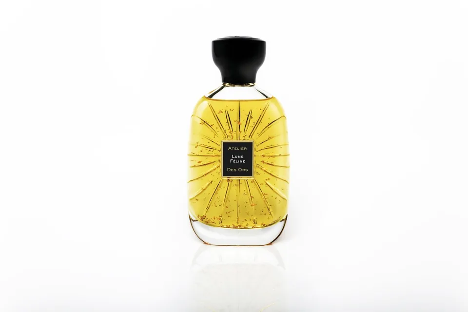
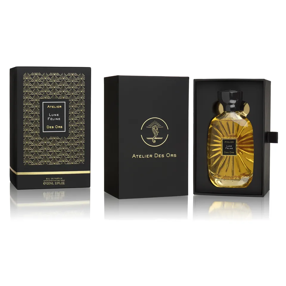
Atelier Des Ors Lune Feline perfume bottle filled with golden fragrance liquid and shimmering gold dust particles against a clean white backdrop. Atelier Des Ors luxury black and gold gift box with embossed pattern and drawer packaging resting next to the open velvet slot holding the perfume flacon on a reflective surface. Extrait 100ml
Lune Féline Extrait
Cardamome · Ambre Gris · Vanille
SAR 1,180 Atelier Des Ors
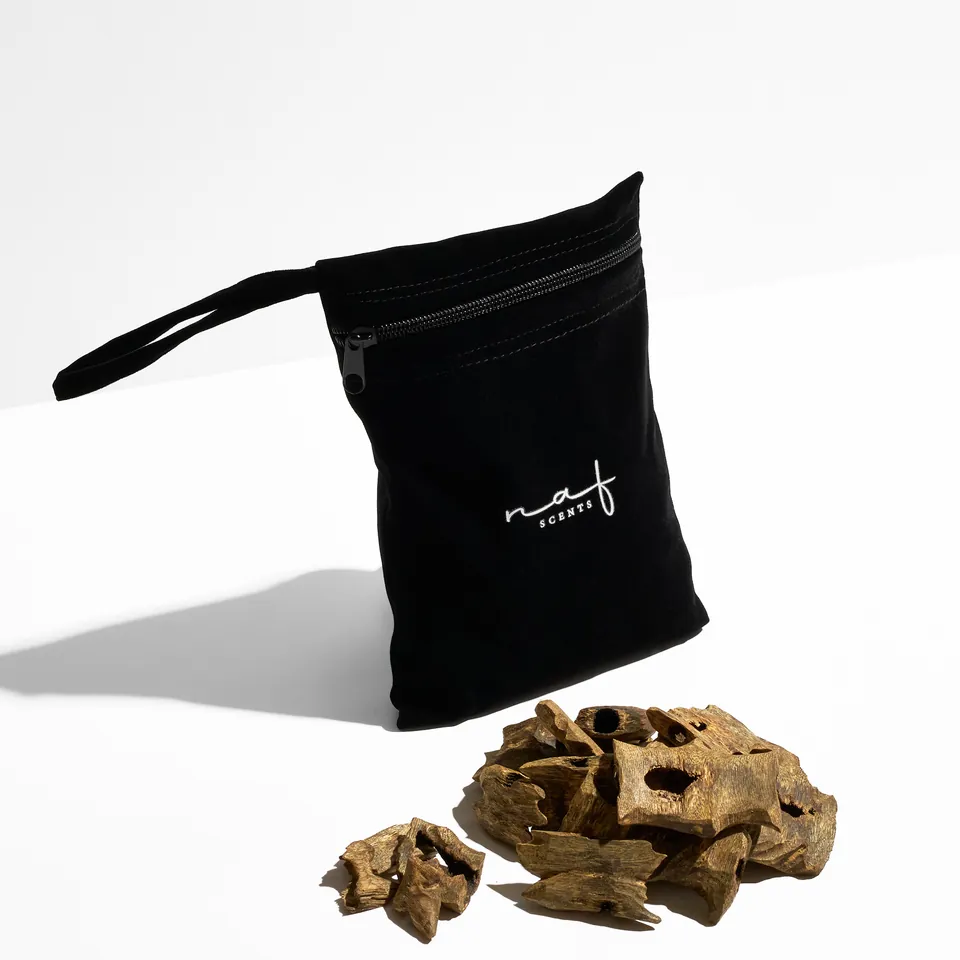
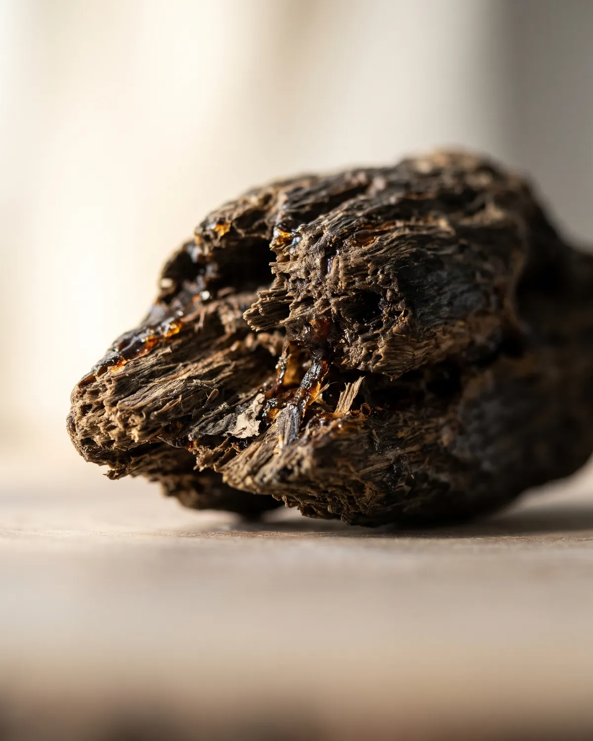
Luxury black velvet pouch with white embroidered Naf Scents calligraphy logo sitting beside a pristine heap of rare aged agarwood oud wood chips on a clean white surface with sharp shadows. Macro close-up of a resinous agarwood chip. AI-generated illustrative image. Reserve Agarwood
Royal Wild Kinam Oud
Assam Terroir · 25-Year Cured Resin
SAR 2,450 Private Collection
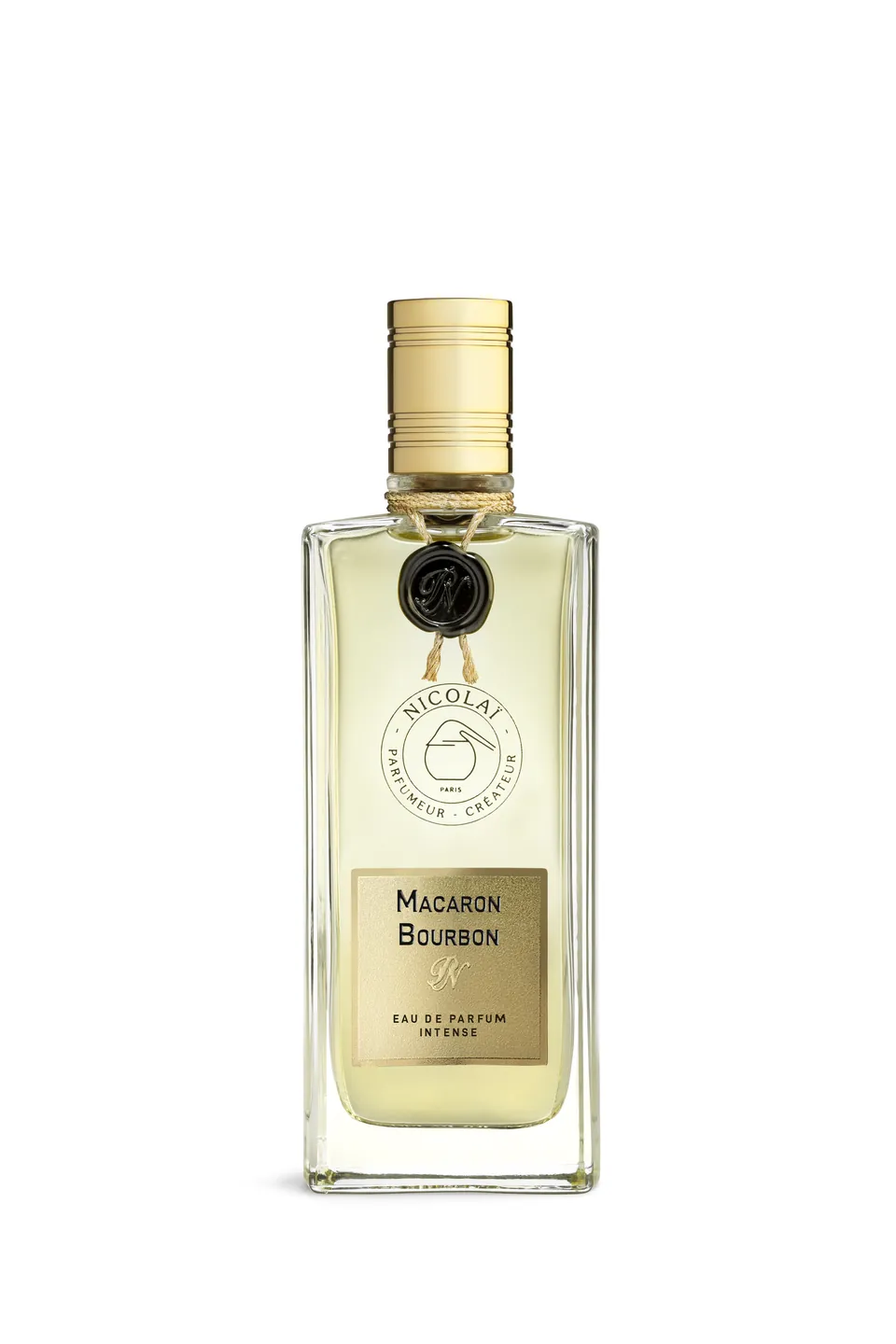
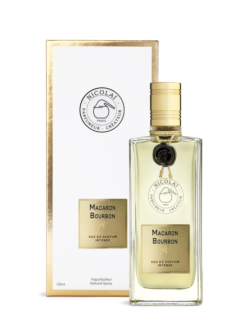
Macaron Bourbon Intense perfume bottle on a clean product background. Macaron Bourbon Intense presentation packaging. Intense EDP
Macaron Bourbon Intense
Rum · Tonka Bean · Caramel Wood
SAR 890 In Stock
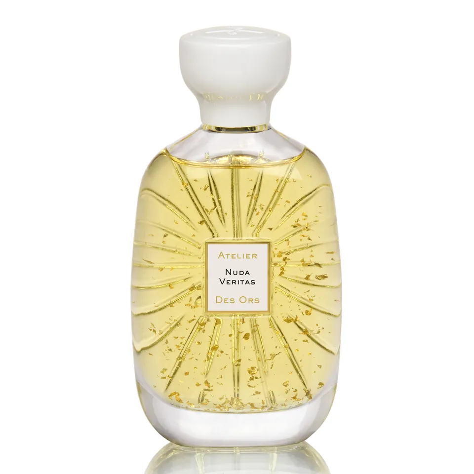
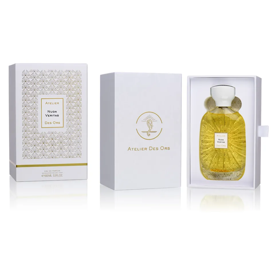
Nuda Veritas perfume bottle on a clean product background. Nuda Veritas presentation packaging. L'Artisan 100ml
Nuda Veritas EDP
Orange Blossom · Osmanthus · Moss
SAR 920 Active Formula
Third-Party Brand Curation Notice (DEC-07): Products depicted above (Atelier Des Ors [Lune Féline, Nuda Veritas], Nicolaï Parfumeur-Créateur [Macaron Bourbon Intense], and catalog references to Rosendo Mateu and Lorenzo Villoresi) represent curated niche brand formulations. Bundled catalog imagery is 72 DPI web reference material; commercial usage rights, photographer releases, and brand exclusivity claims are unverified and tracked under open decision gate DEC-07.
Plate 05.2 · Official pattern and leaf motif masters
Official Graphic Language · CHG-17

Official Pattern & Leaf Motif Architecture

Original, owner-approved vector SVG patterns and leaf motifs from Master_Patterns/. Designed for premium packaging, rigid boxes, tissue wraps, and digital touchpoints.

13 PATTERN & MOTIF SVG MASTERS · APPROVED

01 · NAF Leaf Motif Asset Family (3 SVG Masters · viewBox: 0 0 99.3 56.6)

Master_Patterns/
NAF Leaf Motif Charcoal
Charcoal Leaf Motif
Transparent · Deep Charcoal (Light Surfaces)
naf_leaf_motif_charcoal.svg Download SVG
NAF Leaf Motif Gold
Gold Leaf Motif
Transparent · Desert Gold (Dark Surfaces)
naf_leaf_motif_gold.svg Download SVG
NAF Leaf Motif White
White Leaf Motif
Transparent · Crisp White (Obsidian Surfaces)
naf_leaf_motif_white.svg Download SVG

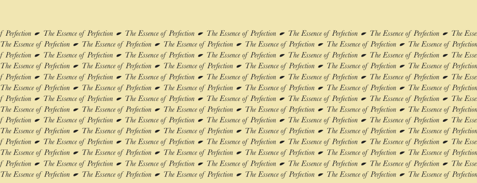
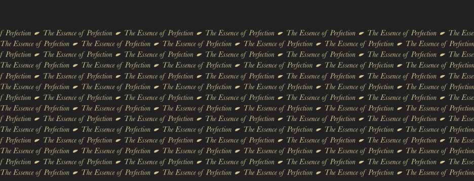
02 · Pattern 01 — Whisper of Luxury (5 SVG Masters · viewBox: 0 0 936 359)

Continuous Typographic Ribbon & Leaf Lattice
Pattern 01 Whisper of Luxury on Cream
On Cream
Embedded BG · #F1E6B2 Plate
naf_pattern_01_..._on_cream.svg Download SVG
Pattern 01 Whisper of Luxury on Charcoal
On Charcoal
Embedded BG · #222223 Plate
naf_pattern_01_..._on_charcoal.svg Download SVG
Pattern 01 Whisper of Luxury White Transparent
White Transparent
Transparent · White Graphic
naf_pattern_01_..._white.svg Download SVG
Pattern 01 Whisper of Luxury Charcoal Transparent
Charcoal Transparent
Transparent · Charcoal Graphic
naf_pattern_01_..._charcoal.svg Download SVG
Pattern 01 Whisper of Luxury Gold Transparent
Gold Transparent
Transparent · Warm Gold Graphic
naf_pattern_01_..._gold.svg Download SVG

03 · Pattern 02 — Flow of Scent (5 SVG Masters · viewBox: 0 0 936 359)

Topographic Contour Rhythm & Scent Dynamics
Pattern 02 Flow of Scent on Black
On Black
Embedded BG · #000000 Plate
naf_pattern_02_..._on_black.svg Download SVG
Pattern 02 Flow of Scent on Charcoal
On Charcoal
Embedded BG · #222223 Plate
naf_pattern_02_..._on_charcoal.svg Download SVG
Pattern 02 Flow of Scent White Transparent
White Transparent
Transparent · White Curves
naf_pattern_02_..._white.svg Download SVG
Pattern 02 Flow of Scent Charcoal Transparent
Charcoal Transparent
Transparent · Charcoal Curves
naf_pattern_02_..._charcoal.svg Download SVG
Pattern 02 Flow of Scent Gold Transparent
Gold Transparent
Transparent · Warm Gold Curves
naf_pattern_02_..._gold.svg Download SVG
Plate 05.3 · Reference imagery library
Reference imagery · logged in program-evidence/AI_IMAGERY_LOG.md

Reference Imagery Library

Generic, AI-generated stand-ins that show the art direction in practice. They are not Naf Scents products and carry no owner approval. The official logo is only ever added from the SVG masters.

AI-generated · illustrative · not owner-approved

01 · Packshots

Blank, unlabelled generic flacon. Black and ivory grounds share one framing so cards and galleries stay consistent.

Blank glass flacon with a brushed champagne cap and amber liquid, on pure black.
packshot-flacon-black-frontPackshot · pure black
Blank glass flacon with a brushed champagne cap and pale gold liquid, on a warm ivory ground.
packshot-flacon-ivory-frontPackshot · ivory
A blank glass flacon with clear amber liquid and a brushed champagne cap on pure black, three-quarter view.
pdp-flacon-3q-blackGallery image · three-quarter, black
A blank glass flacon with amber liquid and a brushed champagne cap on a travertine plinth against warm plaster, three-quarter view.
pdp-flacon-3q-ivoryGallery image · three-quarter, ivory
Macro of a brushed champagne flacon cap and glass shoulder.
pdp-cap-detail-4x5Cap detail · gallery image
A blank flacon on a travertine plinth in raking daylight.
flacon-plinth-3x4Flacon on travertine plinth

02 · Campaign and collection heroes

Keep the upper third calm for headline copy; crop for mobile with the 9:16 and 3:4 versions.

A flacon and an oud chip on a travertine block in a sunlit arched corridor with an olive tree.
hero-campaign-16x9Campaign hero · 16:9
A blank flacon with amber liquid and an agarwood chip on a travertine block in a vaulted limewashed arcade with an olive tree (portrait).
hero-campaign-9x16Campaign hero · 9:16 mobile
A flacon and an oud chip on a travertine block in a sunlit arched corridor (portrait crop).
hero-campaign-mobile-3x4Campaign hero · 3:4 crop
A matte black burner with rising smoke beside a blank flacon on a dark stone slab, travertine blocks behind.
hero-bakhoor-dark-16x9Dark-surface hero · bakhoor
Agarwood chips on a dark stone slab beside a brass dish, with a palm shadow on a plaster wall.
collection-hero-oud-21x9Collection hero · oud · 21:9

03 · Macros

Raw material at honest macro resolution.

Macro of a resinous agarwood chip.
macro-oud-chip-4x5Oud chip macro
Resin glowing on charcoal in a matte black burner, smoke rising.
macro-bakhoor-mabkhara-4x5Bakhoor resin on charcoal

04 · Ingredient tiles

Use a tile only for an ingredient that is in the formula; notes claims come from the formula, not from the image.

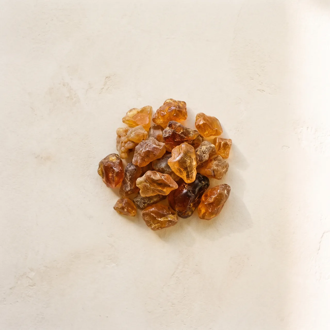
Raw amber resin pieces on ivory plaster.
ingredient-amber-1x1Amber resin
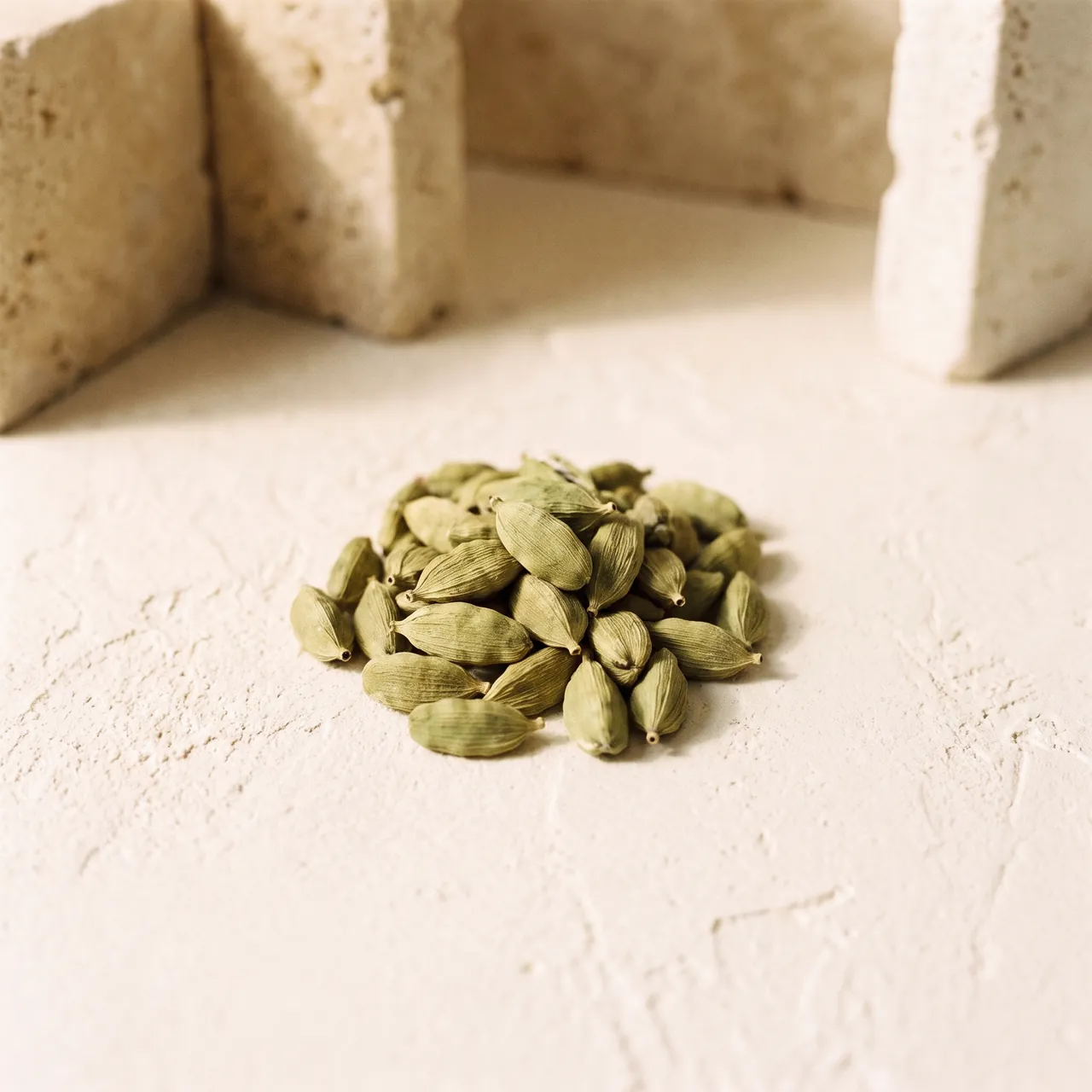
Green cardamom pods on ivory plaster beside travertine.
ingredient-cardamom-1x1Cardamom
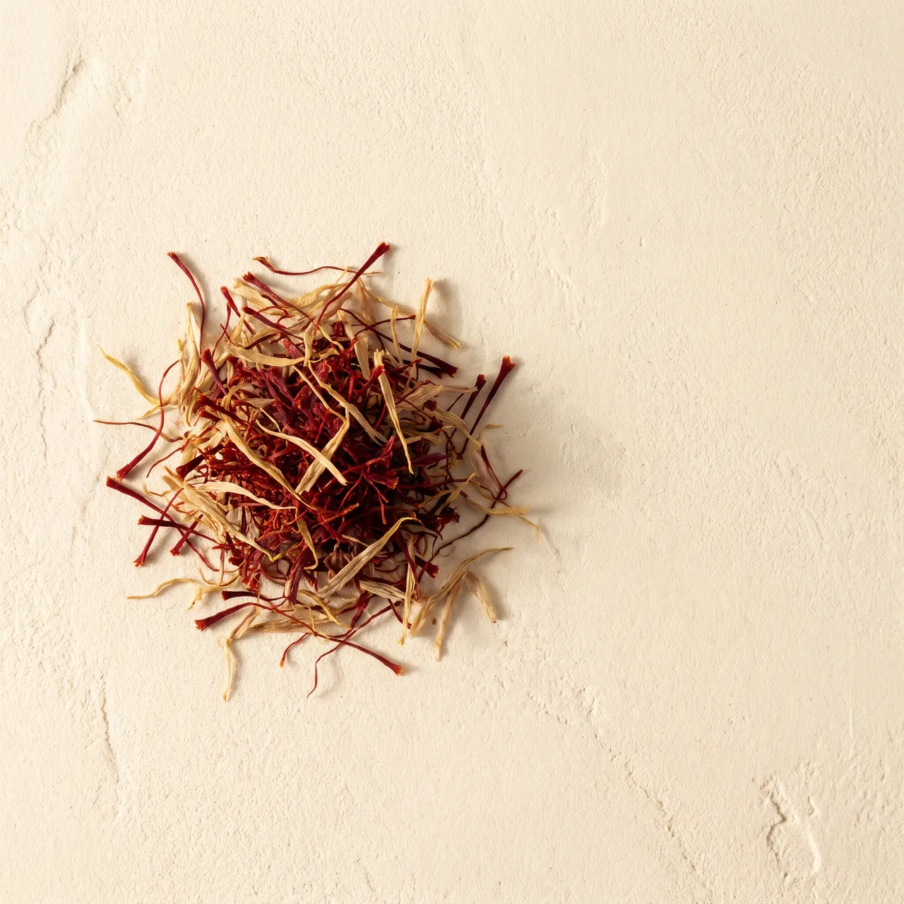
Saffron threads on warm plaster.
ingredient-saffron-1x1Saffron
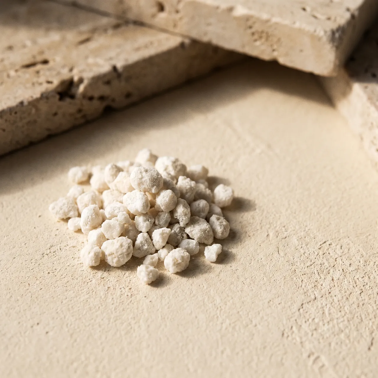
White musk grains on ivory plaster beside travertine.
ingredient-white-musk-1x1White musk

05 · Lifestyle and editorial

No faces. Hands and rooms only; the flacon stays blank and unbranded.

A hand sprays fragrance toward a wrist in window light.
lifestyle-wrist-3x4Fragrance on wrist
A hand holding a blank flacon in linen sleeves against a plaster wall.
lifestyle-hand-flacon-3x4Hand holding a flacon
Smoke rising from a black mabkhara on a plaster surface.
mabkhara-smoke-3x4Smoke from a mabkhara
A contemporary majlis with a low table, a mabkhara and a carved lattice window.
lifestyle-majlis-16x9Contemporary majlis
Sand dunes at dusk under a deep blue sky.
editorial-dunes-dusk-16x9Dunes at dusk
Hands in linen blending oils with a pipette beside amber bottles.
craft-pipette-16x9Craft: blending with a pipette
Plate 05.4 · Identity derivatives and iconography
Derived assets · icons are AI-sourced drawings, not official artwork

Identity Derivatives & Iconography

App icons and the share image come from the official masters. The domain icons and state illustrations are AI-sourced drawings traced to vector and need owner approval before product use.

AI-generated · illustrative · not owner-approved

01 · App and browser icons

Rendered from the official naf_icon masters (not modified). The script mark is thin at 16 to 32 px, so it reads faintly in tabs.

favicon-32 (generated from the official Naf Scents icon master)
favicon-32Browser tab icon
apple-touch-icon-180 (generated from the official Naf Scents icon master)
apple-touch-icon-180Home-screen icon
icon-192 (generated from the official Naf Scents icon master)
icon-192App icon 192
icon-maskable-512 (generated from the official Naf Scents icon master)
icon-maskable-512Maskable app icon
avatar-400-black (generated from the official Naf Scents icon master)
avatar-400-blackSocial avatar · black
avatar-400-alabaster (generated from the official Naf Scents icon master)
avatar-400-alabasterSocial avatar · Alabaster Mist

02 · Share image and email header

The official logo is composited from the SVG master onto an AI-generated background.

Share image: arched corridor with a flacon and the Naf Scents logo
og-share-1200x630Open Graph share image
Email header: agarwood on a stone slab with the Naf Scents logo
email-header-1200x400Email header band

03 · Domain icons

Twelve monoline icons (one stroke weight, round caps), traced to SVG with fill currentColor so they take the surrounding text colour. Everyday UI icons stay Material Symbols.

flaconFlacon
mabkharaMabkhara
oud-chipOud chip
sample-vialSample vial
hand-spraySpray on skin
tissue-bundleWrapped gift
deliveryDelivery
cash-on-deliveryCash on delivery
authenticity-sealAuthenticity
concierge-bellConcierge
secure-lockSecure payment
returnsReturns

04 · State illustrations

Proposed for empty, error, confirmation and failure states in Chapter 06. Monoline, traced to SVG.

empty-bagEmpty bag · D7
404-archway404 page · D8
no-resultsNo results · D7
order-confirmedOrder confirmed
payment-failedPayment failed or offline · C8

For channel crops, licensing records and structural examples, see application guidance.

Chapter 06

Digital UI Standards & E-Commerce Components

Use a 4px button radius, 8px card radius, and soft tonal elevation instead of hard shadows.

Foundations

Digital UI Standards

The implemented standards the e-commerce components below build on: radius geometry, the flacon card, buttons and inputs.

Technical Radius Specification & Utility Mapping (BR-005) RECONCILED

In this project's compiled stylesheet (brand-tailwind-static.css), border-radius tokens are explicitly mapped: Buttons & Form Inputs: 4px radius (--radius-lg: .25rem / utility class rounded-lg). Product Cards & Containers: 8px radius (--radius-xl: .5rem / utility class rounded-xl). Architectural Note: Whereas standard default Tailwind maps rounded-lg to 0.5rem (8px), NAF Scents' custom configuration intentionally defines lg as 0.25rem (4px) and xl as 0.5rem (8px). Code implementations and generative tools must apply rounded-xl for 8px card geometry to ensure strict visual consistency with the design codex.

F1 · Primary Flacon Card SPEC: RAD 8PX / 1PX HAIRLINE
Atelier Des Ors Lune Feline perfume bottle filled with golden liquid resting on clean white surface. -15% Private Concierge
Haute Perfumerie Extrait

Lune Féline Pur Extrait

A nocturnal symphony of Madagascar Bourbon vanilla and dark woods.

Olfactory Accord:
Top: Cardamom Heart: Ambergris Base: Vanilla Bean
SAR 1,180 SAR 1,390
F2 · Button Taxonomy
Primary Solid CTA Radius 4px · #000000
Secondary Architectural Radius 4px · 1px hairline
Frosted Media Control Blur 12px · 55% Obsidian
F3 · Input Fields
Max 28 characters for flacon collar engraving.
Part A of 5

Discovery

Components for finding products. These are best-practice reference proposals (informed by Baymard research, WCAG 2.2 and Apple HIG) and are not owner-approved. Labels, prices and counts in the specimens are illustrative placeholders, not approved taxonomy, products or pricing.

A1 Header & Mega-Menu

Proposed reference · not owner-approved
  • AnatomyLogo (primary lockup, official master), primary navigation, utility icons (search, account, wishlist, cart with count badge) and a mega-menu panel with three link columns and one editorial tile.
  • BehaviorSticky at the top: transparent over the hero, solid white with a hairline after scroll (existing header rule). The mega-menu opens on click or Enter/Space, never hover-only, and closes on Escape, outside click or when focus leaves. The cart badge updates through a polite live region and hides at zero.
  • StatesDefault, hover, focus-visible, current section (aria-current), menu open, badge hidden at 0, 1 to 9, and 9+.
  • MobileBelow 640px the menu becomes a full-height drawer from the inline start, and the existing 56px bottom bar carries Home, Categories, Offers, Cart and Profile.
  • RTL / ArabicThe whole bar mirrors: logo at the inline start, icons at the inline end, the mega-menu opens from the inline start, directional arrows flip, and the cart badge sits on the inline-end corner.
  • AccessibilityA labelled nav landmark; disclosure buttons use aria-expanded and aria-controls; every target is at least 44 by 44 px (WCAG 2.2 target size); the sticky header never hides the focused control (WCAG 2.4.11).

A2 Search with Suggestions

Proposed reference · not owner-approved
  • AnatomyInput with search icon and clear button, a suggestion list in groups (recent searches, suggested terms, products with thumbnail and price) and a "view all results" action. This is storefront search; the guideline search panel above is a separate, implemented component.
  • BehaviorSuggestions appear after 2 characters with a short debounce and the matching text is emphasised. Enter runs the full search; Down/Up move through options; Escape closes, then clears. No results shows spelling help and popular collections, never an empty box. Recent searches stay on the device.
  • StatesIdle, focused, typing, loading (skeleton rows), results, no results, error with retry, disabled.
  • RTL / ArabicInput text and icons mirror. Latin product names keep their own direction inside Arabic text (use bdi or dir="auto"). Matching ignores Arabic diacritics and letter-form variants.
  • AccessibilityARIA combobox pattern: role=combobox on the input, role=listbox with option items, aria-expanded and aria-activedescendant. The result count is announced in a polite live region; focus stays in the input while options are highlighted.

A3 Breadcrumbs

Proposed reference · not owner-approved
  • AnatomyAn ordered list of links that ends with the current page as plain text. Separators are decorative and drawn by the component, not typed into the content.
  • BehaviorShows the product's place in the category hierarchy, not the visitor's browsing history. On narrow screens it collapses to one "back to parent" link. Long names truncate with an ellipsis and stay readable to assistive technology.
  • StatesDefault, hover (underline), focus-visible, current page (not a link).
  • RTL / ArabicThe order reverses with the reading direction and the separator chevron flips to point toward the inline start.
  • Accessibilitynav with aria-label="Breadcrumb" containing an ol; the last item carries aria-current="page"; separators are CSS so they are not announced; touch targets reach 44 px through padding on mobile.

A4 Product Listing Grid

Proposed reference · not owner-approved
  • AnatomyCard with a portrait 4:5 image frame and 1px hairline, a status badge at the inline start, a wishlist toggle at the inline end, then product name (Noto Serif), concentration and size, and price with an optional was-price.
  • Behavior4 columns from 1024px, 3 from 640px, 2 below (matches the existing grid rules and 20 to 30px gaps). The whole card is one link target; a second image on hover or focus is an enhancement, never required. Images below the fold load lazily inside a fixed aspect ratio so nothing shifts.
  • StatesDefault, hover and focus-visible, wishlisted, sale, sold out (dimmed but still linked and labelled), loading skeleton, empty results.
  • RTL / ArabicBadge and wishlist swap sides, the grid fills right to left, and the currency follows reading direction ("SAR 1,180" becomes "1,180 ر.س"). Numerals stay Western (DEC-06).
  • AccessibilityOne link per card named by the product name; price is read in order ("now" and "was" are spelled out for sale prices); the wishlist is a separate 44 px button with aria-pressed; alt text describes the product, not "image".

A5 Filters & Sort

Proposed reference · not owner-approved
  • AnatomyA toolbar (filter trigger, sort, result count), facet groups (checkbox lists with counts, a price range), removable active-filter chips, a clear-all action and, on mobile, an apply button in a drawer.
  • BehaviorResults update as filters change (debounced) and the count is announced. Applied filters stay visible as chips. Filter and sort state lives in the URL so Back, refresh and sharing work. Options with 0 results are disabled, not hidden. On mobile the facets open in a drawer with a sticky "Show N results" button.
  • StatesDefault, selected, hover, focus-visible, disabled (0 results), loading, no match (with a clear-all route).
  • RTL / ArabicThe drawer enters from the inline start, chips wrap right to left, the range slider mirrors (minimum at the inline start) and counts keep Western digits.
  • AccessibilityEach facet is a fieldset with a legend (or a disclosure with aria-expanded); sort is a native select or labelled listbox; chip remove buttons are named ("Remove filter: Oud"); the count is in role="status"; the drawer traps focus and returns it to its trigger.

A6 Pagination & Load More

Proposed reference · not owner-approved
  • AnatomyNumbered pagination (previous, first, current plus or minus one, ellipsis, last, next) and a "Load more" alternative with a position count and progress bar.
  • BehaviorUse numbered pagination for browsing and comparison (24 per page proposed); use Load more for casual scrolling. Never infinite scroll without a visible end and a reachable footer. The page lives in the URL, and focus moves to the results heading after a page change.
  • StatesDefault, current, hover, focus-visible, disabled previous or next at the ends, loading (Load more shows progress), error with retry.
  • RTL / ArabicPrevious and next swap places and their arrows flip; page numerals stay Western.
  • Accessibilitynav with aria-label="Pagination" and a list; the current page has aria-current="page"; previous and next have text labels, not arrows alone; targets are at least 44 px; Load more announces the new count politely.
Part B of 5

Product Page

Components for the product page, from first image to purchase. Best-practice reference proposals, not owner-approved. Sizes, labels and figures are illustrative; policy wording (delivery, returns, authenticity, tax) belongs to the owner and is never written here.

Proposed reference · not owner-approved
  • AnatomyMain image (4:5), thumbnail rail, zoom control and an image counter; a video or 360° slot may sit last when the brand has such media.
  • BehaviorThe first image loads eagerly with high fetch priority and the rest lazily. Click or tap opens a zoomed view (pinch and pan on touch); Left/Right arrows and swipe change images and the thumbnails stay in sync. The frame ratio is reserved so nothing shifts while images load.
  • StatesDefault, hover (zoom cursor), focus-visible, zoomed, loading skeleton, image failed (neutral placeholder with retry).
  • MobileA swipeable carousel with a counter, thumbnails hidden, pinch-zoom enabled and no auto-advance.
  • RTL / ArabicCarousel direction and arrows mirror, the thumbnail rail starts at the inline start, and the counter keeps Western digits ("1 / 5").
  • AccessibilityA labelled carousel region (role="group" with aria-roledescription="carousel"); previous and next buttons are 44 px; the zoom view traps focus and closes on Escape; every image has alt text describing the view; nothing auto-advances (WCAG 2.2.2).

B2 Size & Concentration Selector

Proposed reference · not owner-approved
  • AnatomyA group label that echoes the selected value, option chips with radio behaviour, an optional size-guide link and an inline error line.
  • BehaviorSingle choice, required before adding to the bag; preselect only when there is one option. Unavailable options stay visible, struck through and not selectable, with "notify me" where offered. Choosing an option updates price, stock and gallery without a page reload.
  • StatesDefault, hover, selected, focus-visible, unavailable, and error ("Select a size").
  • RTL / ArabicOptions flow right to left; units use the Arabic form in Arabic ("100 مل") with a space; the check mark keeps its position inside the chip.
  • AccessibilityA radiogroup with a visible legend; selection is not shown by colour alone (thicker border plus a check mark); unavailable options use aria-disabled with the reason; each chip is at least 44 px high.

B3 Price Block

Proposed reference · not owner-approved
  • AnatomyCurrent price, optional was-price, a saving label, a "from" price for ranges, and a slot for the tax and shipping note (wording belongs to the owner's commercial policy).
  • BehaviorOne currency format site-wide: code before the amount in English ("SAR 1,180"), after it in Arabic ("1,180 ر.س"). The sale price leads and the was-price is secondary and struck through. Savings are shown only when accurate. The price follows the selected variant and the change is announced politely.
  • StatesRegular, sale, from-price (range), price on request (no figure) and loading.
  • RTL / ArabicAmount and currency reorder, thousands separators stay a comma, and the was-price follows the current price in reading order.
  • AccessibilitySale status is stated in text ("Now" and "Was"), never by strikethrough or colour alone; text contrast is at least 4.5:1; variant changes go to a polite live region.

B4 Stock & Availability

Proposed reference · not owner-approved
  • AnatomyA status icon, a label, an optional detail line (for example the dispatch window) and, when sold out, a "notify me" action.
  • BehaviorShow status next to the add-to-bag button. A low-stock message appears only when it is true and a threshold is configured: no countdowns, fake scarcity or invented urgency. Sold-out pages stay available and offer notify-me or alternatives.
  • StatesIn stock, low stock, sold out, pre-order (only if the business offers it) and back soon.
  • RTL / ArabicThe icon sits at the inline start and the detail line wraps right to left.
  • AccessibilityStatus is conveyed by icon and text, never colour alone; a change of status is announced through role="status"; the notify-me field has a visible label and an error message tied with aria-describedby.

B5 Delivery, Returns & Assurance

Proposed reference · not owner-approved
  • AnatomyFour short rows near the purchase button: delivery estimate, free-shipping threshold or shipping cost, returns summary, and authenticity assurance, each with an icon, a one-line label and a link to the full policy.
  • BehaviorShow shipping cost or the free-shipping threshold on the product page, because unexpected costs at checkout are a leading cause of abandonment. The delivery estimate depends on the destination; the wording of every promise comes from the owner's policy, not from this document.
  • StatesDefault, destination not set (prompt to choose), estimate unavailable (fallback text) and expanded detail.
  • RTL / ArabicIcons sit at the inline start and policy links read right to left.
  • AccessibilityPlain-language labels; icons are decorative (aria-hidden); links have descriptive names; no information is carried only by an icon.

B6 Notes & Details Accordion

Proposed reference · not owner-approved
  • AnatomyStacked sections, each a heading with a toggle button and a content panel; the first section (fragrance notes in top, heart and base order) is open by default on desktop.
  • BehaviorSeveral sections may be open at once. Content stays in the page so it can be searched and indexed; closed panels are hidden only visually and from the accessibility tree. The open state is not stored in the URL.
  • StatesCollapsed, expanded, hover, focus-visible, and disabled (never used; hide empty sections instead).
  • RTL / ArabicHeadings align to the inline start and the toggle icon sits at the inline end; plus and minus icons do not flip.
  • AccessibilityA button inside each heading with aria-expanded and aria-controls (or native details and summary); Enter and Space toggle; targets are at least 44 px; the panel is a labelled region only when it is long.

B7 Ratings & Reviews

Proposed reference · not owner-approved
  • AnatomyAverage rating with the review count, a distribution of ratings, a sort control, review cards (stars, title, text, date, verified-purchase tag, helpful vote, report) and a write-a-review form.
  • BehaviorOnly real reviews appear; the "verified purchase" tag is used only when verified. Show the distribution, not just the average, and let people sort by newest or most helpful. Reviews display in their original language with an optional translation. Never write, edit or curate reviews to inflate a score.
  • StatesNo reviews yet (invitation to write the first), loading, loaded, sorted, expanded text, submitted and error.
  • RTL / ArabicStars fill from the inline start; the distribution bars grow from the inline start; Latin reviews keep their own direction inside Arabic layouts.
  • AccessibilityThe rating is stated in text ("4.8 out of 5 from N reviews") while the stars are decorative; the review form has visible labels, errors tied with aria-describedby and a star input that is a radiogroup; sort is a native select.

B8 Sticky Purchase Bar (Mobile)

Proposed reference · not owner-approved
  • AnatomyA compact bar with a thumbnail, product name, current price and the primary add-to-bag button.
  • BehaviorAppears on mobile only after the main add-to-bag button scrolls out of view, and hides again when it returns. It sits above the existing 56px bottom navigation, respects the device safe area and never covers a focused control. If no variant is chosen it scrolls to the selector instead of failing silently.
  • StatesHidden, visible, loading (button shows progress), added (confirmation) and error.
  • RTL / ArabicThumbnail at the inline start, button at the inline end; the layout mirrors as a whole.
  • AccessibilityThe button label names the action and the product; the bar is not a trap and does not obscure focus (WCAG 2.4.11); the confirmation is announced through role="status"; targets are at least 44 px.
Part C of 5

Cart & Checkout

Components for the bag and checkout. Best-practice reference proposals, not owner-approved. Payment methods, security statements, shipping and tax wording are owner and provider decisions and are not specified here; figures are placeholders.

C1 Quantity Stepper

Proposed reference · not owner-approved
  • AnatomyA minus button, a numeric field and a plus button joined in one bordered control; the minus becomes a remove icon at quantity 1 in the cart.
  • BehaviorMinimum 1 (or remove with an undo message), maximum is the available stock. The field accepts typing as well as taps and clamps invalid values on blur. Totals update after a short debounce and the change is announced politely. At the stock limit the plus is disabled with a visible reason.
  • StatesDefault, hover, focus-visible, at minimum, at maximum, loading (totals recalculating), error (stock changed).
  • RTL / ArabicMinus, value and plus keep their reading-order positions and the icons do not flip; the numeral stays Western.
  • AccessibilityEach button has a text name ("Decrease quantity of Product name"); the field is a labelled number input with inputmode="numeric"; buttons and field are at least 44 px; the new total is announced through role="status".

C2 Mini-Cart Drawer

Proposed reference · not owner-approved
  • AnatomyA drawer with a heading and item count, a close button, an "added" confirmation, line items, a free-shipping progress line, the subtotal, a primary checkout button and a secondary "view bag" link.
  • BehaviorOpens from the inline end after an item is added so the shopper sees what happened and stays on the page (a slide-out drawer beats a full-page redirect for flow). It never closes by itself. Escape, the close button or an outside click dismiss it. Subtotal excludes shipping unless shipping is known.
  • StatesClosed, open, loading, items present, empty (with suggestions), error (item unavailable) and updated quantities.
  • MobileA full-height sheet from the bottom or inline end with a sticky checkout button above the safe area.
  • RTL / ArabicThe drawer enters from the inline end (the left in Arabic), content aligns to the inline start and the progress bar fills from the inline start.
  • AccessibilityA dialog with an accessible name; focus moves to its heading on open, is trapped inside, and returns to the cart button on close; the background is inert; "added" is announced through role="status"; the free-shipping line is text as well as a bar.

C3 Cart Page

Proposed reference · not owner-approved
  • AnatomyA list of line items (image, name, variant, quantity stepper, line price, remove, move to wishlist), the order summary and a primary checkout button.
  • BehaviorFull cost picture early: shipping, discounts and totals are visible before checkout starts. Item changes keep scroll position and show an undo message after removal. Unavailable items are flagged at the line with a clear next step. The page can be reached without an account.
  • StatesItems present, empty, loading, item unavailable, price changed, stock reduced and error.
  • RTL / ArabicImage at the inline start, price at the inline end, summary column on the inline end side at wide widths.
  • AccessibilityLine items are a list; each action names its item ("Remove Product name"); changes and errors are announced through role="status" and role="alert" respectively; the page has one h1 ("Your bag").

C4 Promo & Gift Code

Proposed reference · not owner-approved
  • AnatomyA collapsed "have a code?" link that reveals an input with an Apply button, then an applied-code chip (removable) and an error line.
  • BehaviorCollapsed by default so a code field does not pull shoppers away from checkout. Apply validates on the server, updates the summary and states exactly why a code failed (expired, minimum spend, excluded items). Codes are case-insensitive and trimmed.
  • StatesCollapsed, expanded, loading, applied, error, and removed.
  • RTL / ArabicInput and button swap sides; codes are typed in Latin and always render left to right (dir="ltr").
  • AccessibilityA disclosure button with aria-expanded; the input has a visible label; errors are tied with aria-describedby and announced through role="alert"; the applied chip remove button is named ("Remove code CODE").

C5 Order Summary

Proposed reference · not owner-approved
  • AnatomyRows for subtotal, shipping, discount, optional tax line and total, with line items collapsible above them on mobile.
  • BehaviorSticky beside the form on desktop and collapsible on mobile with the total always visible. It updates live as shipping, codes or quantities change and shows the same figures from the bag to the confirmation. Shipping shows a price or a clear "calculated at the next step", never a surprise at the end.
  • StatesDefault, shipping pending, discount applied, loading, error (could not recalculate) and collapsed on mobile.
  • RTL / ArabicLabels align to the inline start and amounts to the inline end; discounts keep a leading minus sign and the currency order follows the language.
  • AccessibilityA description list or table with proper headers; the total is announced through role="status" after changes; the mobile collapse button has aria-expanded and names the total.

C6 Checkout Progress

Proposed reference · not owner-approved
  • AnatomyA short ordered list of steps (information, delivery, payment), each with a number or check, a label and a current marker; a guest-checkout option sits at the top.
  • BehaviorKeep checkout to as few steps as the business allows. Completed steps stay editable and Back never loses entered data. Guest checkout comes first; account creation is offered after the order, not before. The bag total stays visible.
  • StatesUpcoming, current, completed (editable), error on a step.
  • MobileSteps collapse to "Step 2 of 3" with the step name.
  • RTL / ArabicSteps run right to left; the connecting line and check marks follow the reading direction; numerals stay Western.
  • AccessibilityAn ordered list inside a labelled nav; the current step has aria-current="step"; completed steps are links; state is shown by text and icon, not colour alone; the page title and h1 change with each step.

C7 Delivery Address Form

Proposed reference · not owner-approved
  • AnatomySingle-column labelled fields: full name, phone with country code, country or region, city, district, street and building, optional postal code and a short-address field where it applies in the market, plus optional delivery notes.
  • BehaviorLabels sit above fields and are never replaced by placeholders. Use the right input types and autocomplete tokens (name, tel, street-address, postal-code) so browsers can fill the form. Accept Arabic and Latin names and addresses. Optional fields say so; required fields are the minimum the carrier needs. Address lookup is an enhancement, never a blocker.
  • StatesDefault, focus-visible, filled, error, disabled (read-only summary after the step) and loading (lookup).
  • RTL / ArabicFields mirror; text direction follows the content (dir="auto"); phone, email and postal fields are always left to right; labels align to the inline start.
  • AccessibilityEach field has a programmatic label, autocomplete and aria-required where needed; helper text uses aria-describedby; targets are at least 44 px high; fields are not limited to one input per phone digit or split names unless needed.

C8 Payment Methods

Proposed reference · not owner-approved
  • AnatomyA radio group of method cards (each with name, short note and icon), the selected method's fields, a "billing address same as delivery" option, and a pay button that states the amount.
  • BehaviorCard entry is handled by the payment provider's hosted fields so card data never touches the site. Use cc-* autocomplete tokens, format card input as people type, and show only the methods that apply. The pay button repeats the total, disables while processing and prevents double submission. Make no security or compliance claims in the interface unless they are verified and owner-approved.
  • StatesDefault, selected, focus-visible, processing, declined (with a retry path), error and success redirect.
  • RTL / ArabicCards mirror; card number, expiry and CVC are always left to right; amounts follow the currency order of the language.
  • AccessibilityA radiogroup with a legend; whole cards are click targets of at least 44 px; provider fields have visible labels and error messages; the processing state is announced through role="status"; declined messages say what to do next.

C9 Form Validation Pattern

Proposed reference · not owner-approved
  • AnatomyPer field: visible label, input, helper text and an inline error with an icon and text. Per form: an error summary at the top with links to each field.
  • BehaviorValidate on blur and on submit, not on every keystroke, and clear an error as soon as the value is fixed. On submit with errors, focus moves to the summary. Messages say how to fix the problem in plain words, and what the shopper typed is never lost.
  • StatesDefault, focus, valid (subtle), error, disabled and submitting.
  • RTL / ArabicError icons and text sit at the inline start; messages are translated in full, not appended to English; field names inside messages match the visible labels.
  • Accessibilityaria-invalid and aria-describedby link each field to its message; the summary has role="alert" or receives focus; errors never rely on colour alone (WCAG 1.4.1) and the error border is 2 px; the text keeps at least 4.5:1 contrast.

C10 Order Confirmation

Proposed reference · not owner-approved
  • AnatomyA confirmation heading with an icon, the order number, an order and delivery summary, what happens next, a continue-shopping action and an optional account creation prompt.
  • BehaviorAppears immediately after payment succeeds and matches the figures shown in checkout. States the delivery estimate and that a confirmation email is on its way, and the page can be saved or printed. Account creation is offered here, with the data already entered, never as a gate earlier in the journey.
  • StatesSuccess, payment pending (clear status), partial failure (item unavailable) and error with a support route.
  • RTL / ArabicSummary and totals mirror; order numbers and email addresses render left to right; the date and delivery estimate follow the language format.
  • AccessibilityFocus moves to the heading on load; the page title announces the confirmation; the status is conveyed by text and icon; an order number can be copied; no timeouts remove the page content.
Part D of 5

Feedback & States

Components that tell shoppers what happened: labels, confirmations, warnings, overlays, loading, empty and error states. Best-practice reference proposals, not owner-approved. Wording for promotions, policies and errors in production belongs to the owner.

D1 Badges & Tags

Proposed reference · not owner-approved
  • AnatomyA small rounded label with text and an optional icon. Types: status (New, Sale, Sold out), trust (Verified purchase) and count (cart or wishlist number).
  • BehaviorBadges are informational, not interactive. Show at most two per card, anchored at the inline-start corner. Use "Sale" only when a price is actually reduced and never invent exclusivity or scarcity ("Limited" only when true and owner-approved).
  • StatesDefault only; count badges also have hidden (0), 1 to 9, and 9+.
  • RTL / ArabicCorner badges move to the inline start (the right in Arabic); icons keep their order inside the label; counts use Western digits.
  • AccessibilityMeaning is carried by the text, never by colour alone; text meets 4.5:1 contrast; the count badge is part of the button's accessible name ("Bag, 2 items").

D2 Toasts

Proposed reference · not owner-approved
  • AnatomyA compact bar with an icon, a one-line message, an optional action (Undo) and a close button. The guideline page already has one implemented toast (3 seconds, role="status"); commerce toasts extend that baseline.
  • BehaviorFor short confirmations only (saved, copied, added). Success toasts last at least 5 seconds, pause while hovered or focused, and stay until dismissed when they carry an action or an error. Show one at a time; never use a toast for information the shopper must act on.
  • StatesEntering, visible, paused (hover or focus), dismissed, and error variant.
  • RTL / ArabicAnchored to the inline end at the bottom; icon at the inline start; the message is translated in full.
  • Accessibilityrole="status" for confirmations and role="alert" for errors; focus is never stolen; the Undo action is reachable by keyboard for as long as the toast is shown (WCAG 2.2.1 timing); motion honours prefers-reduced-motion.

D3 Alerts & Banners

Proposed reference · not owner-approved
  • AnatomyInline alerts (information, success, error) with an icon, a short title and a sentence of help, plus a single announcement bar above the header.
  • BehaviorAlerts sit next to what they describe and stay until the condition changes. Use one announcement bar at most; it is dismissible and the dismissal is remembered for the session. Wording for promotions, shipping or policy comes from the owner.
  • StatesInformation, success, error, dismissed, and with an action link.
  • RTL / ArabicThe accent border and icon sit at the inline start; text aligns to the inline start; the close button sits at the inline end.
  • Accessibilityrole="alert" only for urgent errors, otherwise role="status"; icon plus text, never colour alone; the announcement bar is a labelled region and its close button is named; contrast is at least 4.5:1.

D4 Modal Dialog

Proposed reference · not owner-approved
  • AnatomyA scrim, a centred panel with a title, content, a close button and one primary plus one secondary action.
  • BehaviorUse sparingly: confirmations, the size guide, a quick view. Never as a first-visit newsletter or promotion pop-up. Opening moves focus inside and locks background scroll; Escape and the close button dismiss it; closing returns focus to the trigger. On mobile it becomes a full-width sheet.
  • StatesClosed, opening, open, submitting (primary shows progress) and error inside the dialog.
  • RTL / ArabicClose button at the inline end; actions ordered primary first in reading order; text aligns to the inline start.
  • Accessibilityrole="dialog" with aria-modal="true" and a name from the title; focus is trapped and the page behind is inert; Escape works; initial focus goes to the first control or the title; targets are at least 44 px.

D5 Drawer & Bottom Sheet

Proposed reference · not owner-approved
  • AnatomyA side drawer (24rem) or bottom sheet with a header (title and close), a scrolling body and an optional sticky footer for the primary action; sheets add a drag handle.
  • BehaviorOne shared pattern for the mini-cart, filters and mobile menu. It enters from the inline end (cart) or inline start (menu, filters), locks background scroll and closes with Escape, the close button, an outside tap or a downward swipe on sheets. Never stack drawers.
  • StatesClosed, opening, open, scrolling (header shadow), loading and error.
  • RTL / ArabicDirections swap: the cart drawer enters from the left in Arabic and the menu from the right; the drag handle and sticky footer are unchanged.
  • AccessibilitySame dialog semantics as the modal (name, focus trap, inert background, focus return); swipe gestures always have a button alternative (WCAG 2.5.1); the drawer respects the safe area.

D6 Skeleton Loaders

Proposed reference · not owner-approved
  • AnatomyNeutral blocks that match the final layout: image frame, title line, price line; a small inline progress indicator is used inside buttons.
  • BehaviorShow a skeleton only after about 300 ms so fast loads do not flash. Dimensions equal the final content so nothing shifts when it arrives. They are static by default: a shimmer or pulse is new motion and needs owner approval under the motion spec. Content failures replace the skeleton with an error state.
  • StatesLoading, loaded (replaced), failed (error state) and timed out (retry).
  • RTL / ArabicBlocks align to the inline start; the shape of the layout mirrors with the real content.
  • AccessibilityThe loading region has aria-busy="true" and a polite status message ("Loading products"); skeleton shapes are hidden from assistive technology; contrast of placeholders is not required but they must not be mistaken for content.

D7 Empty, No-Results & Unavailable

Proposed reference · not owner-approved
  • AnatomyAn optional icon or official pattern, a plain heading, one helpful sentence and one primary action. Covers empty bag, empty wishlist, no search results, no filter matches and unavailable items.
  • BehaviorSay what happened and what to do next, never just "nothing here". No-results offers spelling help, a way to clear filters and popular collections. Unavailable items stay visible with the reason and a notify-me or alternative route. Artwork, if used, comes from the official masters and is never altered.
  • StatesEmpty bag, empty wishlist, no results, no filter matches, sold out and region unavailable.
  • RTL / ArabicCentred layout is direction-neutral; icons that imply direction (arrows) flip; Arabic copy is written natively, not translated word by word.
  • AccessibilityThe heading is a real heading; the primary action is a link or button with a clear name; changes from content to empty are announced through role="status"; illustrations are decorative.

D8 Error Pages & Offline

Proposed reference · not owner-approved
  • AnatomyError code, a plain heading, a one-sentence explanation, primary and secondary recovery actions and a support route, all inside the normal header and footer.
  • BehaviorReturn the true HTTP status (404, 500) so search engines and tools behave correctly. Never blame the visitor; offer search and home. Network failures keep entered data and offer retry. Server errors during checkout preserve the bag and form values.
  • States404, 500, offline, session expired (sign in again, data kept) and maintenance.
  • RTL / ArabicLayout mirrors; the numeric code stays Western and left to right; the Arabic message is written natively.
  • AccessibilityThe page title states the error; focus lands on the heading; recovery actions are real links or buttons; the offline notice uses role="status"; text contrast is at least 4.5:1.
Part E of 5

Trust & Account

Components that build trust and bring shoppers back. Best-practice reference proposals, not owner-approved. Every promise, guarantee, policy and consent wording is supplied by the owner and legal advisers; none is written or implied in this document.

E1 Trust & Assurance Bar

Proposed reference · not owner-approved
  • AnatomyA short row of three or four items, each with a line icon, a two-word label and one supporting line. It corresponds to the existing "value proposition ribbon" in the brand spec (authenticity, delivery, secure payments).
  • BehaviorPlace it near the purchase button, in the bag and above the footer. Only claims the business can substantiate belong here and each links to the full policy. Do not imitate third-party seals or certifications. The wording is owner-supplied; this document does not write guarantees.
  • StatesDefault and with link (hover and focus-visible); never a carousel or auto-rotating.
  • RTL / ArabicItems flow right to left, icons sit at the inline start and the whole row mirrors.
  • AccessibilityA list of items; icons are decorative; each supporting line is real text of at least 4.5:1 contrast; links have descriptive names such as "Read the returns policy".

E2 Wishlist

Proposed reference · not owner-approved
  • AnatomyA heart toggle on cards and the product page, and a wishlist page with a grid of saved items, each with remove, move-to-bag and availability.
  • BehaviorGuests can save items without an account; the list is kept on the device and merged when they sign in. Toggling gives immediate feedback and an undo. Sold-out items stay listed with a notify-me action. Prices shown are always current.
  • StatesNot saved, saved, loading, empty list (with a shop link), item unavailable, and error with retry.
  • RTL / ArabicThe heart sits at the inline end of the image; the grid fills right to left; counts keep Western digits.
  • AccessibilityThe heart is a button with aria-pressed and a name that includes the product ("Save Product name to wishlist"); the result is announced through role="status"; the remove button is named per item; targets are at least 44 px.

E3 Account & Orders

Proposed reference · not owner-approved
  • AnatomyAccount navigation (orders, addresses, details, sign out), an order list of cards (number, date, status, total) and an order detail with a status track, items, delivery address, totals and actions.
  • BehaviorOrder status uses the carrier's and shop's real states only and shows a tracking link when one exists. Guests can look up an order with the order number and email. Reorder adds available items to the bag and says what could not be added. Sign-in offers email plus password or a one-time code; account creation is optional and comes after checkout.
  • StatesSigned out, signed in, no orders yet, order in progress, delivered, cancelled or returned, and error loading orders.
  • MobileThe account tabs become a horizontally scrollable list or a select; order cards stack with the status first.
  • RTL / ArabicTabs and the status track run right to left; order numbers, emails and tracking codes render left to right; dates follow the language format.
  • AccessibilityAccount navigation is a nav with aria-current; the status track is an ordered list with text for every step; forms follow the validation pattern (C9); never use a CAPTCHA that blocks assistive technology without an alternative; sessions warn before timing out (WCAG 2.2.1).
Proposed reference · not owner-approved
  • AnatomyLink columns (shop, help, company), the newsletter slot, region and language selector, accepted payment methods where the owner lists them, legal links (privacy, terms, returns) and the copyright line, on the Obsidian ground used by the Chapter 02 plate.
  • BehaviorAppears on every page with the same content. Help and policy links are always reachable without scrolling a mega-menu. Columns collapse to accordions on mobile. Contact details and legal names come from the owner. The language selector keeps the current page and the user's choice (see the language switcher spec).
  • StatesDefault, link hover and focus-visible, column expanded or collapsed (mobile).
  • RTL / ArabicColumns run right to left, text aligns to the inline start, and URLs, emails and phone numbers stay left to right.
  • AccessibilityA footer landmark with nav regions labelled by column; link text of at least 4.5:1 on the dark ground; focus rings use the white halo (see the focus note); targets are at least 44 px.

E5 Newsletter Sign-up

Proposed reference · not owner-approved
  • AnatomyA heading, an email field with a visible label, an unchecked consent checkbox with the owner's wording, a subscribe button and success or error messages; it sits in the footer or at the end of a page.
  • BehaviorNever a first-visit pop-up. Consent is explicit and unchecked by default; confirmation method (single or double opt-in) and data wording are decided by the owner and legal. Say what will be sent and how often, and keep an easy unsubscribe link in every message. Errors keep what was typed.
  • StatesDefault, focus-visible, error (invalid email), submitting, success (awaiting confirmation), already subscribed and failure with retry.
  • RTL / ArabicField and button swap sides, the email field is left to right, and the consent text is written natively in Arabic.
  • AccessibilityThe email field has a programmatic label, type="email" and autocomplete="email"; errors follow the validation pattern; results are announced through role="status"; the consent checkbox is a real checkbox with a clear label.
  1. Implementation reference & coverage

    Working specification · exact existing tokens, component anatomy, states, responsive and RTL rules, verification criteria, and DTCG/Figma compatibility. Coverage status describes specification completeness; it is not release approval.

  2. Native iOS & iPadOS extension

    Reference specification · proposed platform mapping, based on Apple guidance. No app or commerce requirements are approved. Native font licensing, Arabic review and dark appearance values require owner decisions.

Chapter 07

Production Handoff & Audit Governance Checklist

This section records handoff assets, production specifications, source rights, and unresolved approvals.

  1. Vector Identity Kit

    Official Owner-Approved SVG Masters: 14 logos, 3 leaf motifs, and 10 patterns. Complete 27-file master archive with preserved directory structure.

  2. JSON Design Tokens

    Exportable Tailwind CSS config, CSS variables, and W3C token formats for engineering handoff.

  3. Web Typography Package

    Self-hosted WOFF2 web fonts: Noto Serif, Manrope and Noto Naskh Arabic (Latin, Latin-ext and Arabic subsets) plus the Material Symbols icon font, with @font-face CSS and license texts (SIL OFL 1.1 and Apache-2.0).

  4. Editorial Press Campaign

    Reference imagery only. Licensed press masters, camera originals, and production-resolution files are not included; rights require DEC-07 verification.

Designer Judgment Calls & Audit Checklist

Section 07.4 Validation
Hot Foil Stamping on Raw Cotton Stock APPROVED DESIGNER CALL

Specified Kurz Luxor 428 foil with high-frequency micro-etching to eliminate halo bleeding on 450gsm textured unboxing drawers.

Olfactory Scented Unboxing Tissue Mist [NEEDS INPUT: Atelier Chemistry]

Determining oil concentration threshold for the signature tissue paper mist so that volatile top notes do not deteriorate packaging adhesive during GCC summer logistics.

Trademark Registration Marks in Arabic Lockups LEGAL REVIEW

GCC Class 3 (Perfumes & Cosmetics) and Class 4 (Incense & Bakhoor) registration symbol positioning relative to the Arabic terminal ligature of "ناف".

Brand Asset Access & Compliance Standards

Official Brand Assets & Implementation Directives

Guidelines for authorized partners, suppliers, and media representatives deploying NAF Scents brand assets across print and digital touchpoints.

  1. Authentic Vector Masters

    All brand executions must strictly reference the 27 owner-approved SVG masters. Unofficial approximations, manual retracing, and modified colorations are strictly prohibited.

  2. Authorized Commercial Use

    NAF Scents identity assets and trademarks are proprietary. Commercial reproduction, packaging dieline manufacture, and editorial features require prior written authorization.

  3. Governance & Specification Access

    Engineering tokens, component anatomy, and complete specifications are codified in the technical reference package for certified developers and partners.

AI Brand Governance & Knowledge Retrieval

Working extension of the existing authority protocol · source precedence, evidence metadata, image and editorial controls, approval gates, and seven reusable templates. Governance proposals await DEC-08 owner ratification; Arabic copy awaits native review.

Editorial, photography & channel applications

Proposed structural guidance · social posts, stories, announcements, banners, email and advertisements. Every application requires an asset/rightsholder record, channel export specification and human review. Examples establish no new campaign approval. Packaging & Unboxing remains Coming Soon.

Chapter 08

Packaging — Coming Soon

Packaging development is deferred by the owner. This guide does not publish approved packaging specifications or manufacturing requirements.

  1. Owner-deferred development

    Historical concepts remain references only; no production approval or timeline is implied.

NEW CHAPTER 09 · PDF pp. 26–45

09 · Physical Brand Applications

Mockups are visual precedents for production briefs; no editable artwork files, sizes or rights are implied beyond stated PDF details.

For canonical photography and image direction, see Art Direction.

PDF pp. 27–29PDF SOURCE · APPROVAL UNVERIFIED

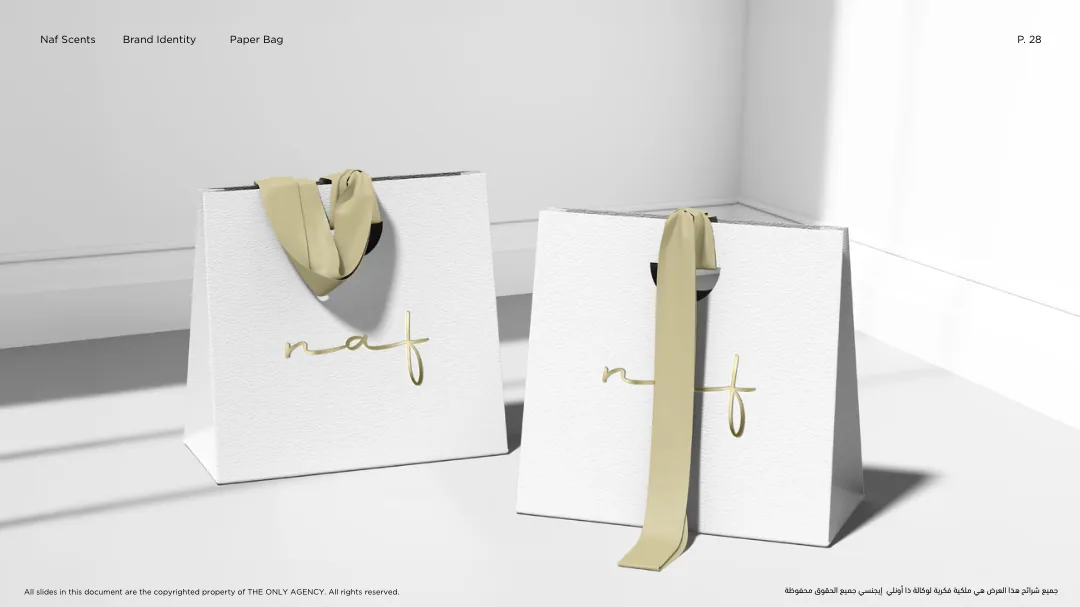
White Boutique Bag

White textured bag with metallic logo and ribbon handles — proposal rendering from PDF page 28
PDF p. 28 · White textured bag with metallic logo and ribbon handles · click to enlarge

Gift-edition white bag with light-gold handles, warm metallic branding and crisp texture. The PDF shows concepts rather than full printer dielines.

PDF pp. 39–41PDF SOURCE · APPROVAL UNVERIFIED

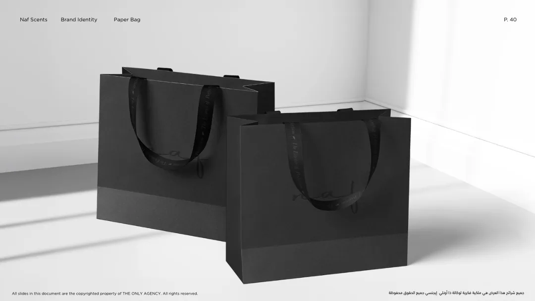
Black Boutique Bag

Black matte boutique bag and black fabric handles — proposal rendering from PDF page 40
PDF p. 40 · Black matte boutique bag and black fabric handles · click to enlarge

Personal-edition black bags use tonal black handles and discreet marking; materials, minimum logo size and finished measurements require production definition.

PDF pp. 42–45PDF SOURCE · APPROVAL UNVERIFIED

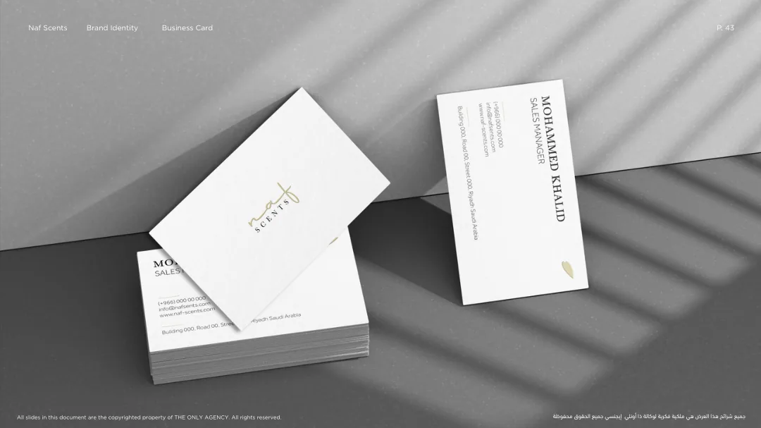
Business Card System

Business card front and rear with serif name hierarchy — proposal rendering from PDF page 43
PDF p. 43 · Business card front and rear with serif name hierarchy · click to enlarge

White card with restrained muted-gold leaf/logo. The PDF supplies mockups but not definitive sizes, bleed, ink profiles, type licenses or editable templates.

PDF pp. 26, 38PDF SOURCE · APPROVAL UNVERIFIED

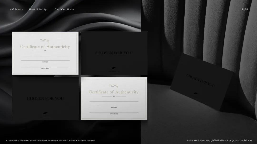
Certificates of Authenticity

Certificate cards in black and white configurations — proposal rendering from PDF page 38
PDF p. 38 · Certificate cards in black and white configurations · click to enlarge

The presentation depicts gift and personal-edition certificates. Field names, verification workflow, serial-number logic and anti-counterfeit rules are not specified.

PDF p. 37PDF SOURCE · APPROVAL UNVERIFIED

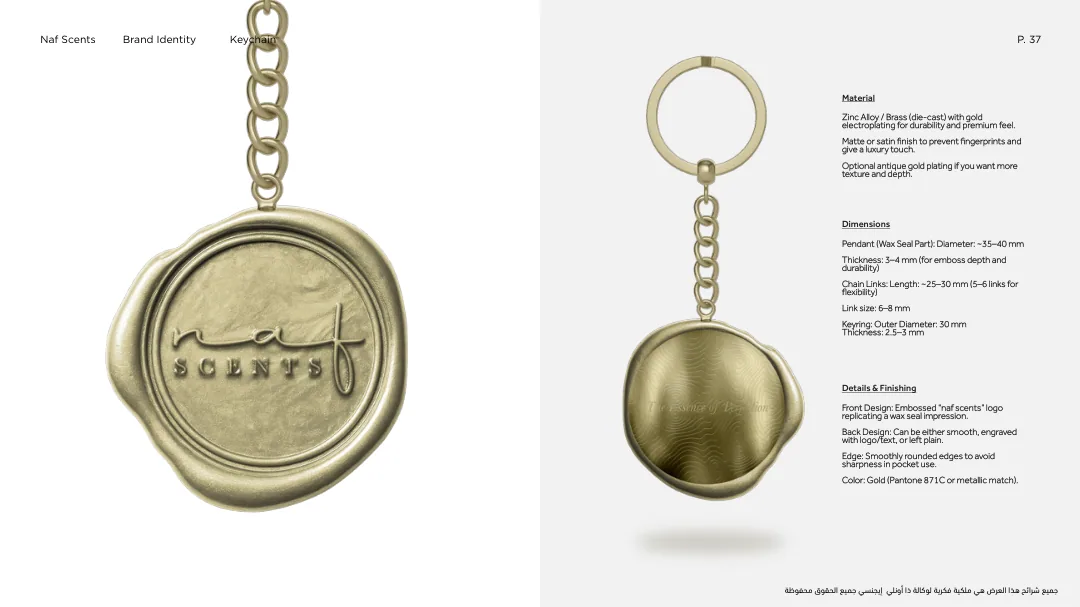
Gold Brand Keychain

Wax-seal-inspired gold metal branded pendant — proposal rendering from PDF page 37
PDF p. 37 · Wax-seal-inspired gold metal branded pendant · click to enlarge
  • Proposed zinc-alloy or brass with gold electroplating; matte/satin finish.
  • Pendant diameter ~35–40 mm, thickness 3–4 mm.
  • Chain ~25–30 mm; keyring outer diameter ~30 mm.
  • PDF suggests metallic Pantone 871 C or supplier-matched gold finish.
PDF pp. 17–18PDF SOURCE · APPROVAL UNVERIFIED

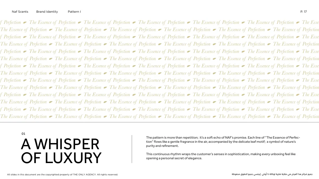
Brand Pattern Across Touchpoints

Repeated brand promise and leaf motif reference — proposal rendering from PDF page 17
PDF p. 17 · Repeated brand promise and leaf motif reference · click to enlarge

Production files for repetitive patterns, foil impressions, fabric weaving and layout proportions must be prepared from licensed vector masters rather than extracted page illustrations.

Before approving artwork, validate THE ONLY AGENCY’s ownership/licensing notice (PDF p. 02), review any individual contact information shown in mockups, and obtain original print files and supplier specifications. This edition does not reproduce the PDF itself or commercial font files.